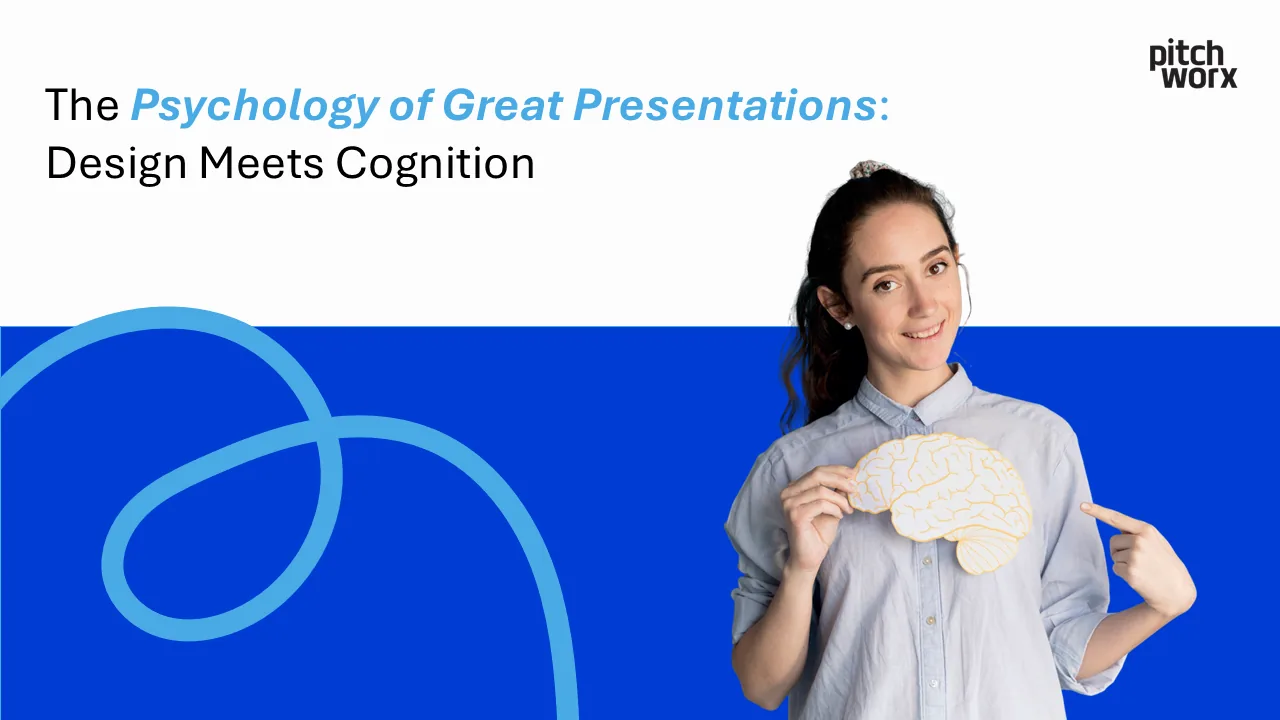
Have you ever wondered why some presentations captivate audiences while others fall flat? The answer lies not just in content or delivery, but in the fascinating intersection of psychology, neuroscience, and design. Understanding how the human brain processes visual information can transform your presentations from forgettable to unforgettable.
At PitchWorx, we’ve spent years studying the cognitive science behind effective presentations. In this comprehensive guide, we’ll explore the psychological principles that make presentations stick, the neuroscience of visual communication, and actionable strategies to design slides that work with, not against, your audience’s brain.
- The Neuroscience of Visual Processing
- Cognitive Load Theory in Presentation Design
- The Psychology of Color in Presentations
- Attention and Memory: Making Your Message Stick
- Emotional Design: Creating Connection
- The Power of Visual Storytelling
- Gestalt Principles in Slide Design
- Typography and Readability Psychology
- The Science of Data Visualization
- Psychological Triggers for Persuasion
- Common Cognitive Biases in Presentations
- Practical Application: Psychology-Based Design Tips
- Frequently Asked Questions
The Neuroscience of Visual Processing
How the Brain Processes Visual Information
The human brain processes visual information 60,000 times faster than text. This isn’t just a random statistic – it’s rooted in our evolutionary biology. Understanding this process is crucial for creating presentations that resonate on a neurological level.
The Visual Processing Pathway:
- Retina to Visual Cortex: Information travels in milliseconds
- Pattern Recognition: The brain seeks familiar shapes and structures
- Meaning Attribution: Context and memory assign significance
- Emotional Response: The amygdala processes emotional content before logical analysis
The 3-Second Rule
Research shows that viewers form first impressions of a slide within 3 seconds. During this critical window:
- 55% of communication is visual (body language, design)
- 38% is vocal (tone, pace)
- Only 7% is verbal (actual words)
This explains why professional presentation design can dramatically impact message retention and audience engagement.
Cognitive Load Theory in Presentation Design
Understanding Mental Capacity
Cognitive Load Theory, developed by John Sweller, reveals that our working memory can only process 5-9 pieces of information simultaneously. This limitation has profound implications for slide design.
Three Types of Cognitive Load
- Intrinsic Load: The inherent difficulty of the content itself. Complex topics naturally require more mental processing power.
- Extraneous Load: Unnecessary mental effort caused by poor design choices: Cluttered layoutsInconsistent formattingDecorative elements without purposeComplex animations
- Cluttered layouts
- Inconsistent formatting
- Decorative elements without purpose
- Complex animations
- Germane Load: The mental effort used to create schemas and long-term memories – this is what we want to maximize.
Reducing Cognitive Overload
Design Strategies:
- Chunking: Break information into digestible pieces
- Progressive Disclosure: Reveal information sequentially
- White Space: Give the brain room to breathe
- Consistent Layouts: Reduce processing needed for navigation
The PitchWorx design team specializes in creating presentations that optimize cognitive load for maximum comprehension.
The Psychology of Color in Presentations
Color and Emotional Response
Colors trigger immediate psychological and physiological responses. Understanding color psychology can help you guide your audience’s emotional journey.
Primary Color Associations
Red:
- Psychology: Urgency, passion, danger, energy
- Use Cases: Call-to-action, warnings, highlighting critical data
- Physiological Effect: Increases heart rate and creates urgency
Blue:
- Psychology: Trust, stability, professionalism, calm
- Use Cases: Corporate presentations, financial data, technology
- Physiological Effect: Lowers blood pressure, promotes focus
Green:
- Psychology: Growth, health, money, environmental
- Use Cases: Sustainability topics, financial gains, health presentations
- Physiological Effect: Easiest color for eyes to process
Yellow:
- Psychology: Optimism, creativity, caution
- Use Cases: Innovation topics, warnings (when paired with black)
- Physiological Effect: Stimulates mental activity
Cultural Color Considerations
Colors carry different meanings across cultures:
- White: Purity in Western cultures, mourning in Eastern cultures
- Red: Good fortune in China, danger in Western contexts
- Purple: Royalty globally, but mourning in some South American countries
The 60-30-10 Rule
Professional designers use this color distribution principle:
- 60%: Dominant color (usually neutral)
- 30%: Secondary color (supports the dominant)
- 10%: Accent color (for emphasis and CTAs)
Attention and Memory: Making Your Message Stick
The Attention Economy
In our information-saturated world, attention is the scarcest resource. Understanding attention psychology helps create presentations that cut through the noise.
Types of Attention
- Selective Attention: Focusing on relevant stimuli
- Sustained Attention: Maintaining focus over time
- Divided Attention: Processing multiple information streams
The Serial Position Effect
Audiences remember:
- Primacy Effect: The first 10% of your presentation
- Recency Effect: The last 10% of your presentation
- The Middle: Often forgotten (the “forgetting curve”)
Strategic Implications:
- Place critical messages at the beginning and end
- Use pattern interrupts in the middle
- Reinforce key points multiple times
Memory Encoding Strategies
The Picture Superiority Effect: People remember 80% of what they see and do, versus 20% of what they read. This is why visual storytelling services are so effective.
The Von Restorff Effect: Items that stand out are more likely to be remembered. Design applications:
- Use contrast for important points
- Break patterns strategically
- Create visual anchors for key concepts
Emotional Design: Creating Connection
The Emotional Brain vs. The Rational Brain
The limbic system (emotional brain) processes information milliseconds before the neocortex (rational brain). This means emotional responses shape how we interpret logical information.
Emotional Design Principles
- Visceral Design (Immediate Impact) First impressionsAesthetic appealColor and imagery choices
- First impressions
- Aesthetic appeal
- Color and imagery choices
- Behavioral Design (Usability) Intuitive navigationClear information hierarchySmooth transitions
- Intuitive navigation
- Clear information hierarchy
- Smooth transitions
- Reflective Design (Lasting Impression) Brand alignmentMessage resonanceCall-to-action clarity
- Brand alignment
- Message resonance
- Call-to-action clarity
Triggering Positive Emotions
Design Elements That Create Connection:
- Faces: Human brains are wired to notice faces
- Stories: Narrative structures activate multiple brain regions
- Metaphors: Bridge familiar concepts with new ideas
- Humor: Releases dopamine, improving retention
The Power of Visual Storytelling
Why Stories Work: The Neuroscience
When we hear stories, our brains activate as if we’re experiencing the events ourselves. This phenomenon, called “neural coupling,” makes storytelling a powerful presentation tool.
The Story Arc in Presentations
- Setup: Establish context and characters
- Conflict: Introduce the problem or challenge
- Resolution: Present your solution
- Transformation: Show the positive outcome
Visual Narrative Techniques
Progressive Reveal: Build suspense by revealing information gradually
Visual Metaphors: Complex concepts become memorable through familiar comparisons
Data Storytelling: Transform statistics into human-centered narratives PitchWorx’s storytelling experts help clients craft compelling visual narratives that resonate emotionally and logically.
Gestalt Principles in Slide Design
Understanding Visual Perception
Gestalt psychology reveals how our brains organize visual information into meaningful patterns. These principles are fundamental to effective slide design.
Key Gestalt Principles
- Proximity: Elements close together are perceived as related Application: Group related contentBenefit: Reduces cognitive load
- Application: Group related content
- Benefit: Reduces cognitive load
- Similarity: Similar elements are perceived as belonging together Application: Use consistent colors/shapes for related conceptsBenefit: Creates visual hierarchy
- Application: Use consistent colors/shapes for related concepts
- Benefit: Creates visual hierarchy
- Continuity: The eye follows the smoothest path Application: Align elements along clear pathsBenefit: Guides attention flow
- Application: Align elements along clear paths
- Benefit: Guides attention flow
- Closure: The mind completes incomplete shapes Application: Use partial images or graphicsBenefit: Increases engagement through active processing
- Application: Use partial images or graphics
- Benefit: Increases engagement through active processing
- Figure-Ground: We instinctively separate foreground from background Application: Create clear contrastBenefit: Improves focus on key elements
- Application: Create clear contrast
- Benefit: Improves focus on key elements
- Common Fate: Elements moving together are grouped Application: Coordinate animationsBenefit: Reinforces relationships
- Application: Coordinate animations
- Benefit: Reinforces relationships
Typography and Readability Psychology
The Science of Readability
Typography affects both comprehension speed and emotional response. Research shows that font choice can impact perception of credibility by up to 75%.
Font Psychology
Serif Fonts (Times New Roman, Georgia):
- Psychology: Traditional, trustworthy, formal
- Best For: Financial presentations, academic content
- Cognitive Impact: Slower reading, higher retention
Sans-Serif Fonts (Arial, Helvetica):
- Psychology: Modern, clean, approachable
- Best For: Tech presentations, contemporary brands
- Cognitive Impact: Faster reading, better for screens
Script Fonts:
- Psychology: Elegant, personal, creative
- Best For: Limited use, luxury brands
- Cognitive Impact: Difficult to read in quantity
Readability Factors
- Font Size: Minimum 24pt for presentations
- Line Spacing: 1.5x for optimal readability
- Contrast: High contrast reduces eye strain
- Character Spacing: Proper kerning improves flow
The F-Pattern and Z-Pattern
Eye-tracking studies reveal reading patterns:
- F-Pattern: For text-heavy slides
- Z-Pattern: For visual-focused slides
Design your layouts to match these natural scanning patterns.
The Science of Data Visualization
Pre-Attentive Processing
Certain visual attributes are processed instantly, before conscious thought:
- Color
- Size
- Orientation
- Movement
- Position
Leveraging these attributes makes data instantly understandable.
Chart Psychology
Bar Charts:
- Best For: Comparisons
- Psychological Impact: Easy ranking perception
Line Graphs:
- Best For: Trends over time
- Psychological Impact: Shows progression/regression
Pie Charts:
- Best For: Part-to-whole relationships
- Psychological Impact: Quick proportion understanding
Heat Maps:
- Best For: Pattern identification
- Psychological Impact: Immediate hot spot recognition
Data Visualization Best Practices
- Remove Chart Junk: Every element should serve a purpose
- Use Color Strategically: Highlight key insights
- Tell the Story: Don’t just show data, explain what it means
- Progressive Complexity: Start simple, add detail as needed
PitchWorx’s data visualization team transforms complex data into clear, compelling visual stories.
Psychological Triggers for Persuasion
Cialdini’s Principles of Influence
Robert Cialdini’s research identifies six psychological triggers that drive decision-making:
- Reciprocity: People feel obligated to return favors Application: Offer valuable insights before asking for actionDesign Element: Free resources or exclusive data
- Application: Offer valuable insights before asking for action
- Design Element: Free resources or exclusive data
- Commitment and Consistency: People align with previous commitments Application: Start with small agreementsDesign Element: Progressive yes-ladder slides
- Application: Start with small agreements
- Design Element: Progressive yes-ladder slides
- Social Proof: People follow the crowd Application: Show testimonials, case studiesDesign Element: Client logos, success metrics
- Application: Show testimonials, case studies
- Design Element: Client logos, success metrics
- Authority: People defer to experts Application: Establish credibility earlyDesign Element: Credentials, awards, partnerships
- Application: Establish credibility early
- Design Element: Credentials, awards, partnerships
- Liking: People say yes to those they like Application: Build rapport through designDesign Element: Relatable imagery, appropriate humor
- Application: Build rapport through design
- Design Element: Relatable imagery, appropriate humor
- Scarcity: People value rare opportunities Application: Highlight unique value propositionsDesign Element: Limited-time offers, exclusive access
- Application: Highlight unique value propositions
- Design Element: Limited-time offers, exclusive access
The AIDA Model in Presentations
Attention → Interest → Desire → Action Each slide should move your audience through this psychological journey.
Common Cognitive Biases in Presentations
Understanding and Leveraging Biases
Cognitive biases are mental shortcuts that influence decision-making. Ethical presenters understand these biases to communicate more effectively.
Confirmation Bias: People seek information confirming existing beliefs
- Strategy: Acknowledge opposing views before presenting your solution
Anchoring Bias: First information heavily influences subsequent judgments
- Strategy: Set favorable anchors early in your presentation
Availability Heuristic: Recent or memorable examples seem more probable
- Strategy: Use vivid case studies and examples
Halo Effect: One positive trait influences overall perception
- Strategy: Lead with your strongest point
Loss Aversion: People fear losses more than they value gains
- Strategy: Frame solutions as avoiding losses, not just gaining benefits
Overcoming Audience Biases
- Acknowledge Preconceptions: Address them directly
- Use Familiar Frameworks: Build on existing mental models
- Provide Social Proof: Counter individual biases with group evidence
- Create Cognitive Dissonance: Challenge assumptions respectfully
Practical Application: Psychology-Based Design Tips
The 10 Commandments of Psychological Design
- Simplify Ruthlessly One idea per slideRemove non-essential elementsEmbrace white space
- One idea per slide
- Remove non-essential elements
- Embrace white space
- Create Visual Hierarchy Size indicates importanceColor draws attentionPosition guides flow
- Size indicates importance
- Color draws attention
- Position guides flow
- Use the Rule of Three Groups of three are most memorableThree main points per sectionThree supporting arguments
- Groups of three are most memorable
- Three main points per section
- Three supporting arguments
- Leverage Contrast Size contrast for emphasisColor contrast for clarityConceptual contrast for memorability
- Size contrast for emphasis
- Color contrast for clarity
- Conceptual contrast for memorability
- Align Everything Creates professional appearanceReduces cognitive frictionGuides eye movement
- Creates professional appearance
- Reduces cognitive friction
- Guides eye movement
- Be Consistent Same fonts throughoutConsistent color paletteUniform spacing and margins
- Same fonts throughout
- Consistent color palette
- Uniform spacing and margins
- Tell Stories Use case studiesCreate scenariosShow transformation
- Use case studies
- Create scenarios
- Show transformation
- Show, Don’t Tell Use visuals over textDemonstrate with examplesInclude screenshots or demos
- Use visuals over text
- Demonstrate with examples
- Include screenshots or demos
- Design for Scanning Clear headlinesBullet points for listsBold key phrases
- Clear headlines
- Bullet points for lists
- Bold key phrases
- End with Action Clear next stepsSpecific calls-to-actionContact information
- Clear next steps
- Specific calls-to-action
- Contact information
Psychological Design Checklist
Before finalizing your presentation, ask:
- ✓ Does each slide have a clear focal point?
- ✓ Is the cognitive load manageable?
- ✓ Are emotions appropriately engaged?
- ✓ Does the flow tell a coherent story?
- ✓ Are psychological triggers ethically employed?
- ✓ Will the key messages be remembered?
Advanced Psychological Techniques
The Peak-End Rule: People judge experiences by their peak moment and how they end. Implications:
- Create a memorable high point
- End on a strong, positive note
- Summarize key benefits in closing
The Zeigarnik Effect: Unfinished tasks stick in memory better than completed ones. Applications:
- Tease upcoming sections
- Use cliffhangers between segments
- Leave strategic questions unanswered until the end
Mirror Neurons and Presentation Design: Mirror neurons fire both when we act and when we observe others acting. Design implications:
- Show people using your product/service
- Include human elements in visuals
- Demonstrate rather than describe
Case Studies: Psychology in Action
Case Study 1: Tech Startup Pitch Deck Challenge: Complex AI technology needed simple explanation Psychological Approach:
- Used familiar metaphors (AI as “digital assistant”)
- Progressive disclosure of technical details
- Emotional hook through problem storytelling
Result: 85% increase in investor interest
Case Study 2: Sales Enablement Presentation Challenge: Motivate sales team with new methodology Psychological Approach:
- Social proof through peer success stories
- Gamification elements for engagement
- Clear visual progress indicators
Result: 92% adoption rate within 30 days View more success stories from PitchWorx clients who’ve leveraged psychological design principles.
The Future of Presentation Psychology
Emerging Trends:
- Neurodesign: Using brain imaging to optimize designs
- Personalization: AI-driven customization based on audience psychology
- Interactive Presentations: Engaging multiple senses
- VR/AR Integration: Immersive psychological experiences
Continuous Learning: The field of presentation psychology evolves constantly. Stay updated:
- Follow cognitive science research
- Test and measure your presentations
- Gather audience feedback
- Iterate based on psychological insights
Conclusion: Design with the Brain in Mind
Understanding the psychology behind great presentations transforms good presenters into great ones. By aligning your design choices with how the brain naturally processes information, you create presentations that don’t just inform – they inspire, persuade, and drive action.
The intersection of psychology and design isn’t just academic theory; it’s a practical toolkit for anyone who wants to communicate more effectively. Whether you’re pitching investors, training teams, or sharing ideas, these psychological principles give you a scientific edge.
Remember: every design choice – from color selection to slide transitions – has a psychological impact. Make those choices consciously, strategically, and ethically.
Ready to create psychologically optimized presentations that drive results? Contact PitchWorx to work with experts who understand both the art and science of presentation design.
Frequently Asked Questions
Q1: How many psychological principles should I apply in one presentation?
A: Quality over quantity. Focus on 3-5 core principles that align with your objectives rather than trying to use every technique.
Q2: Can psychological design techniques backfire?
A: Yes, if overused or applied inappropriately. Always prioritize authenticity and ethical communication over manipulation.
Q3: What’s the most important psychological principle for presentations?
A: Cognitive Load Theory. If your audience can’t process your information, no other technique matters.
Q4: How do I know which psychological approach to use?
A: Consider your audience, context, and objectives. PitchWorx consultants can help you develop a targeted psychological strategy.
Q5: Do these principles work across all cultures?
A: While many principles are universal, cultural considerations are crucial. Always research your specific audience’s cultural context.
Q6: How can I measure the psychological impact of my presentations?
A: Track metrics like engagement time, retention rates, and action taken. A/B testing different psychological approaches provides valuable insights.
Q7: Should I explain the psychology to my audience?
A: Generally no. The techniques work best when seamlessly integrated into your design and content.